Five Indicators of a Poorly Designed Website – and How to Avoid Them
| November 8, 2017 | Posted in Content Creation
Your website is the backbone of your entire digital marketing strategy. Poorly designed websites can bring traffic to a screeching halt, and send potential customers running to your competitors. These are the five most common, and harmful, website design mistakes you can make. Read on and avoid them like the plague.

1. Your design isn’t responsive.
In 2016, internet usage on mobile devices surpassed desktop computers for the first time. Mobile and tablet users made up 51.2% of traffic, while desktop users only made up 48.7% of traffic. Your website should be catering to this influx of mobile traffic – not ignoring it.
One of the biggest design mistakes you can make is not having responsive design built into your website. Responsive design will automatically resize a webpage for optimal viewing on any size device. This ensures that the site remains easy to navigate and can still convert visitors, no matter the device they’re using.
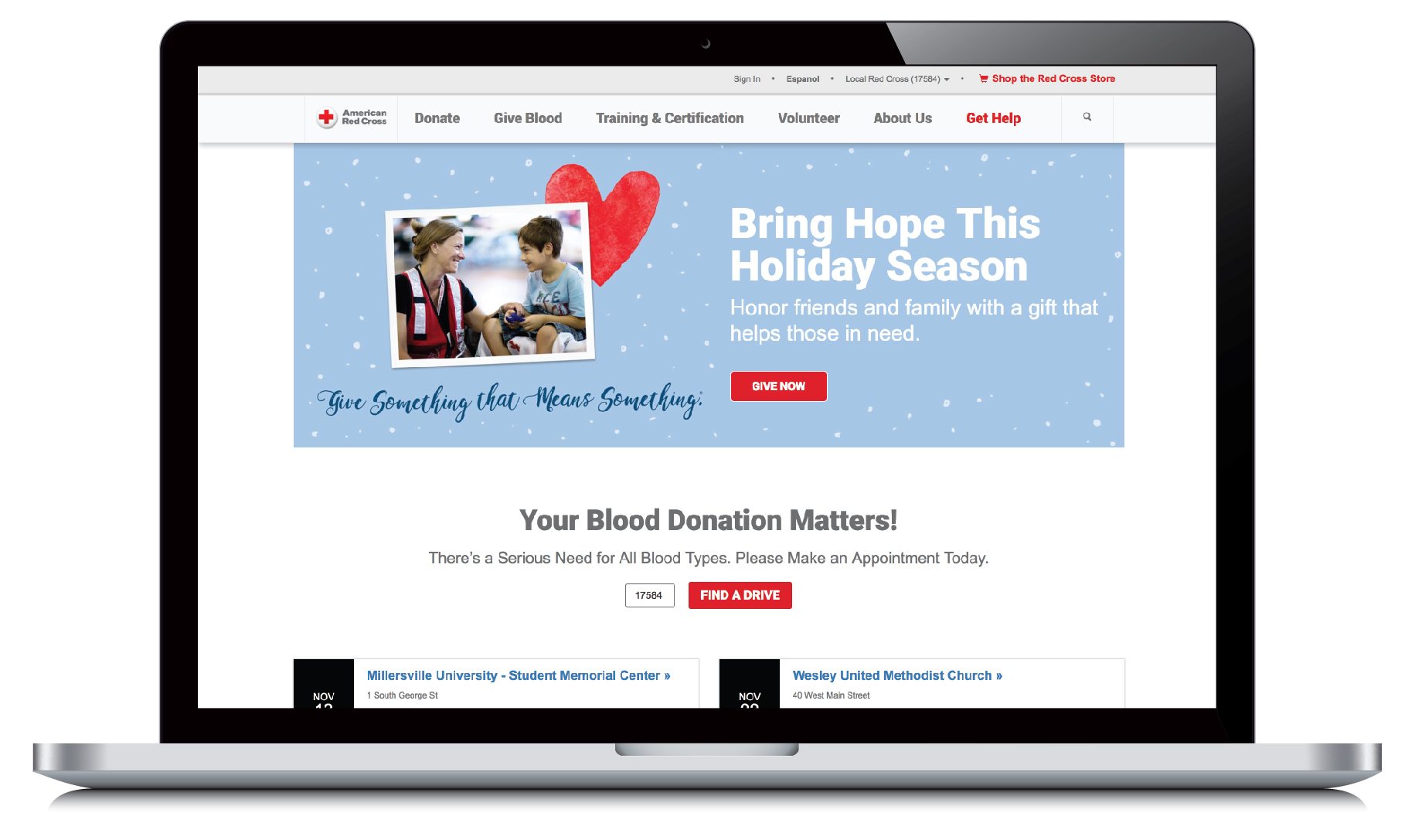
Example:
Here’s how our site looks on a desktop vs. a smartphone. Those on a smartphone don’t lose any of the functionality of a desktop user.

2. You won’t invest in the design or development of your website.
If you truly want a high-performing website that looks incredible and pulls visitors through your desired sales funnels, you’ll want to invest in expert help. Unless you have a degree in web design and development, it’s smart to bring in an outside team to achieve your vision. There are plenty of free website builders out there, but they really shouldn’t be used for a business that’s working towards bigger goals. You won’t get full functionality and performance out of a free website builder.
Not investing in your site’s design and development can also lead to issues like slow page load time, that affects overall performance. Pages that take even just a few seconds longer than competitors will push potential customers away.
Read our article ‘9 Common Causes of Slow Page Load Time’ to see what might be causing your depressing statistics.
3. You haven’t prioritized search engine optimization (SEO).

You want Google to recognize your website as a valuable source of content. There are many ways to optimize your website for search engines, but they all start with the basic design of your site. Google wants to see a website that is easy to read, updates frequently, and matches the search terms entered.
Make sure your design doesn’t make any of the following SEO errors.
- Pages filled with one, long paragraph of text. Instead break up the paragraphs with headers, lists, images, etc. This will make it easier for a user, and search engine, to crawl the page and figure out what it’s about.
- You haven’t added any long-tail keywords to your website. Each of your pages should be specifically written to appeal to one or two long-tail keywords. The content, title, and headers should all revolve around a keyword that’s relevant to that page.
- Your images don’t contain alt tags. These tags identify what the image is and can contain relevant keywords. Read other Image SEO Tips here.
- There’s no blog capability on your website. A blog is one of the best tools you have to show search engines that you’re always updating your content to stay relevant and accurate. It’s also a proven way to drive more organic traffic to your website via search engine.
4. Your website isn’t designed to optimize conversion rates (CRO).
Conversion rate optimization is a method of increasing the number of completed sales funnels without necessarily increasing the amount of traffic on your website. You’re optimizing your website to convert more visitors.
You can read our entire CRO series starting with ‘Understanding CRO: Defining Conversion Rate Optimization’ here.
Here are a few CRO mistakes you want to make sure your site design doesn’t make.
- Failing to include a call-to-action on a page. A visitor reads your product page – what next? If you want them to call you, give them a button to click to call you from their smart phone. If you want them to fill out a form, make the form obvious and enticing. Pick a call-to-action and highlight it.
- Not capturing any visitor information. How can you keep in contact with visitors to your site? By asking for information that makes it easy to follow up via email, calling, etc. Make sure your website is designed to include some type of entry form that captures this information for you to utilize later on.
- Not tracking any website analytics. Set up a free Google analytics account and then add that tracking code to every page on your website. This will give you access to valuable data like unique visitors, page views, and bounce rates.
5. The design has caused navigation issues.
How long does it take for a visitor to find what they’re looking for on your website? The longer it takes, the less likely it is that they’re going to become a customer. Internet users are used to immediate gratification. Make it easy for them to find the information they need and continue on to the decision stage of the buying process.
Here’s some examples of navigation issues within website design you’ll want to avoid.
- Your content is located in an unexpected place. Don’t make someone have to do an internal search to find the content they’re looking for.
- There’s no breadcrumbs. Make it simple to go back to the previous page, the original landing page, and even the homepage. It should be clear how a user got to the page they’re currently on, and it should be simple to backtrack.
- You created a microsite that strands the user. A user clicks on a piece of content that takes them to a visually beautiful microsite that goes in-depth about the content. But what happens if they want to go back to the main site? Have you made it obvious that they’ve left the original site and created an obvious pathway back to that site?
- Your basic contact information is hidden. Your address, phone number, and or email should be the easiest information to find on the website. Make sure it isn’t hidden only in the footer or under a misleading category.
Get more information by reading ‘Improve Your Website’s Navigation with these 9 Best Practices.
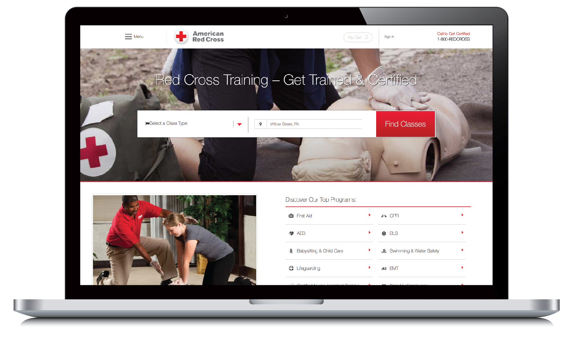
Example:
If you click on the ‘Training & Certification’ tab of the American Red Cross’ main website, it takes you to a separate, branded microsite. This jump can confuse users. Once you click on that tab, you’re suddenly redirected to a new site with a completely different layout and the none of the same categories in the menu. If you have a microsite set up, make sure it’s still simple to navigate back to your main website.
Web Design Best Practices
Even as technology evolves, the basic lessons stay the same. Your design should always:
1) Make it easy to find the desired information.
2) Make it easy to read and understand that information.
3) Make it obvious where to click and what the user is clicking to.
If you’re currently designing a website, considering a redesign, or simply want to improve upon your existing website – the main goal is always the user experience. It’s vital to see the website through their eyes, so try to incorporate user testing into any redesign process. Let us know in the comments what major mistakes you’ve seen on poorly designed websites.

Kick Start Your Digital Marketing Goals
Subscribe to our blog for regular digital marketing updates and advice. Discover what a great website and online experience can do for your business. Sign up for FREE now.
