Was Terrible Interface Design to Blame for Hawaii’s False Alert?
| January 26, 2018 | Posted in Content Creation
Today we’re investigating how terrible government interface design may have been to blame for a false missile alert. Government agencies, especially within emergency management, regularly deal disaster preparedness. With so many lives relying on their systems, you’d think they would put a greater emphasis on their interfaces’ design and ease of use. Alas, their lack of focus on these issues may have led to the events in Hawaii on January 13th, 2018.
False Emergency Alert Blamed on Human Error
Hawaii Residents spent 38 minutes of their Saturday morning in unnecessary terror. On January 13th, a statewide emergency notice was sent out reading,
BALLISTIC MISSILE THREAT INBOUND TO HAWAII. SEEK IMMEDIATE SHELTER. THIS IS NOT A DRILL.
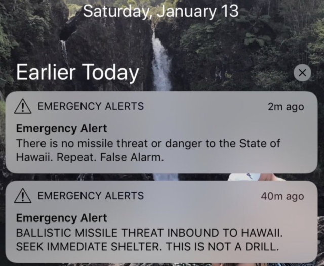
It took 38 minutes for emergency officials to send out a second alert clarifying that this was a false alarm.
The Hawaii Emergency Management Agency has since shared that an employee clicked on the wrong prompt during a shift change drill. On Tuesday, officials distributed a mock image of what the employee may have saw on their software interface during the drill (They claim they cannot share an actual image due to security reasons).
The employee should have clicked DRILL-PACOM (DEMO) STATE ONLY, and instead clicked PACOM (CDW) – STATE ONLY. The false alarm prompt was added after Saturday’s mistake.
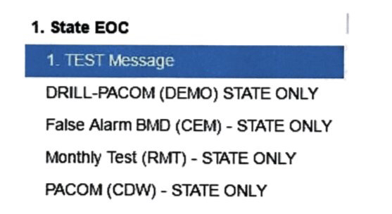
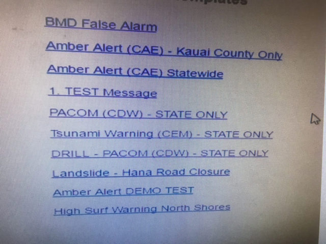
It’s worth noting that a different image of the interface was circulated a day prior to the above mock-up. Representatives said the original screenshot was not an accurate image.
Hawaii officials have been widely criticized, not only for the original mistake, but also their handling of that mistake.
Did Bad Design Contribute to Human Error?
While officials blame human error for the incident, those of us familiar with usability and design are nervously laughing over the shared interface images. If these designs are anything remotely close to what that employee was using, saying it was ‘human error’ is ignoring the elephant in the room. Poor interface design almost certainly played a part in this story.
Since officials have not been completely transparent about the processes leading up to the error, we can only speculate on what went wrong. It’s important to remember that interface design is only one component when working towards usability. You must also take into account other organizational processes, corporate culture, verbal and written communications, and any adjacent systems the employee was also using. All of these factors combine to either create a system that works – or a system that constantly blames humans for its errors.
Based on the images alone, here are a few speculations we do have about why the interface is such a bad design.
- There was no link sent out with the emergency alert. Where could people go for information about this alert? There was no link, no web page that provided more details about how to seek shelter, no confirmation about what was truly happening. Setting up an accompanying web page with these alerts should be a priority.
- The test prompt and live prompt are within the same interface. Why would there not be separate interfaces and screens for test alerts and live alerts? If you’re planning on simply running a test – there should be no chance that you could send out a live alert.
- Placing DRILL at the beginning of the link does not provide enough design differentiation. All of the links look wildly similar. The human eye should be able to notice a large difference between a live nuclear button and its test button.
- Ensure there’s 2-step authentication. While officials said their interface included an extra step to confirm the statewide alert, they should revisit the wording of that second step. Does it make it clear what action the user is about to take?
The false missile alert is just one example of poor interface design. This story shares how a hospital’s charting software may have contributed to the death of a little girl. This article talks about how an aircraft’s cockpit design led to a fatal crash.
Want an example of an interface that actually does its job well? Visit www.gov.uk. This government website has won awards for its smart user design.
How can government agencies improve upon these usability issues?
Expert Per Axbom lists these five steps for addressing negative design issues:
1) Listen and understand what has gone wrong.
2) Accept and assume ownership of the problem. Recognize that it is within your power to address it.
3) Present your findings to achieve leadership buy-in for taking action.
4) Be transparent with your findings and your response to the problem.
5) Be prepared to add positive friction, ensuring that people are more mindful of the consequences of their actions within the system.
Now is the prime time for officials to reevaluate their emergency systems and ensure that terrible design is not contributing to human error. While releasing false images of the employee interface does not inspire confidence or show transparency, they still have the opportunity to be better. Let’s hope that this incident shows government agencies just how important smart interface design and the usability of a system truly is.
How would you improve their interface design? Do you think Hawaiian officials handled the incident correctly? We’d love to hear your opinions in the comments!
Is your user interface easy to use?
Find out how your user interface could be improved by contacting Quantum Dynamix. Whether you’re a government agency or a small business, if you need help with interface design, contact us today!
